What is Data Visualisation? (other than making complex things look pretty)

Have you ever opened a spreadsheet filled with facts and figures and thought…‘huh’? If so, you're certainly not alone.
When you're dealing with a lot of data, you might spend a good 10 minutes just staring at a screen of numbers, columns and READ.ME notes before doing anything remotely productive. And this is normal, because our brains aren't designed to absorb an onslaught of figures with no apparent logic.
But fear not. As fun as it is to mindlessly stare at things, there is a better way to digest, share and celebrate data so everyone can understand what it means and the story behind it. It’s a magical thing that makes key trends and stories stand out in a flash, engages even the biggest spreadsheet haters of the world and makes data EVEN sexier (yes that is possible).
It's known as data visualisation, and we'll go into what it is and why it matters below.
Data visualisation
Now, most of us have heard of data visualisation (or data viz, as the cool kids call it), but if you haven’t, we'll define data visualisation for you using this simple formula:
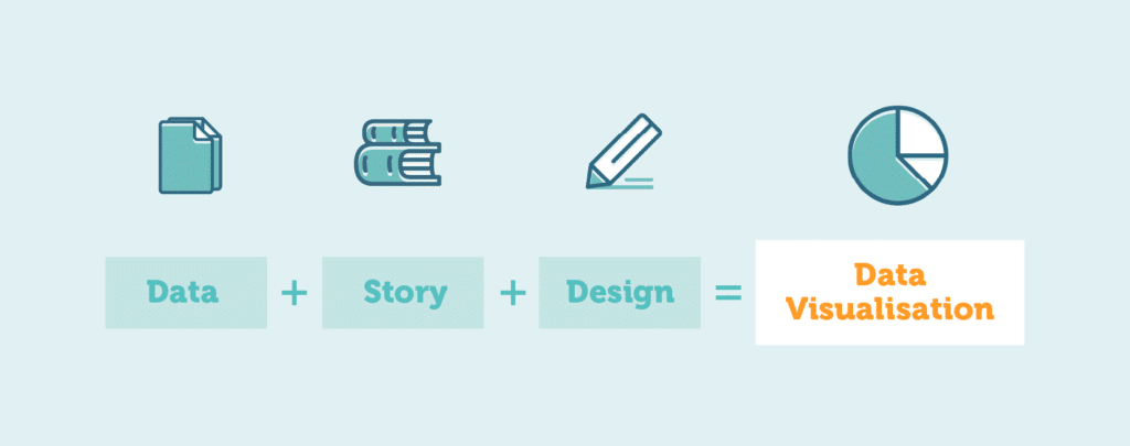
Easy. Kinda.
The problem with data viz, is that design is hugely subjective. Designs, formats and interactive elements that might be super clear and beautiful to you, could be tragically complicated and unattractive to someone else. This disconnect between creator and user is common, you only have to Google ‘infographic’ to see an array of designs that someone, somewhere, at some point thought were great, but which don’t show a clear story and/or are extremely difficult to navigate and digest.
Technically, any visualisation of data is data viz, but there's certainly an argument that any visualisation that is just as bamboozling as the raw data, is less ‘viz’ and more just data. And we need the ‘viz’, guys - it’s the second best part.
Key data viz trends in 2025
Data visualisation has evolved rapidly in recent years, and 2025 is no exception. Here are some of the biggest trends shaping the field right now:
- AI-generated data visualisation – With advancements in AI, automated tools can now generate complex, insightful data visualisations in seconds, helping businesses and analysts save time.
- Interactive & personalised visualisations – Data viz is becoming more interactive, allowing users to filter and explore data in a way that’s meaningful to them.
- Augmented & Virtual Reality (AR/VR) data visualisation – Immersive visualisation techniques allow users to engage with complex data in 3D environments, providing deeper insights.
- Mobile-first data visualisation – More people consume content on their phones, so modern data viz must be designed with smaller screens in mind, ensuring clarity and usability on mobile devices.
Where to find great data viz inspiration
Now that we’ve covered what data visualisation is, here are some fantastic places online where you can find effective and impactful examples:
- Information is Beautiful: A showcase of beautifully designed, informative visualisations.
- Flowing Data: A blog dedicated to exploring how data tells stories through visualisation.
- The Pudding: A site featuring in-depth visual essays using data-driven storytelling.
- Tableau Public: A platform where users can publish and explore data visualisations from across industries.
Next, we'll run though some of Aira’s own digital PR campaigns to dissect them and show how data viz can help communicate cool stories and make data more readable and relatable.
Offshore Wind Turbines
This campaign used data visualisation to tell a compelling story about how offshore wind turbines can power major cities. Given the complexity of the methodology behind the calculations, data visualisation helped make the information more digestible.
We started by calculating the energy consumption of each city using data from the International Energy Agency. We then estimated how much energy a single wind turbine could generate. By dividing the total energy consumption for each city by the output of one turbine, we determined how many turbines would be needed to meet each city's annual energy demand. We also factored in the necessary spacing between turbines to avoid interference.
Despite the complexity of these calculations, we visualised the results in a way that was easy for anyone to understand. Instead of overwhelming viewers with raw numbers, the infographic highlighted three key data points per city:
- % of city area needed for offshore turbines
- Number of offshore turbines required
- Total km² of offshore turbines needed
These figures provided a quick and intuitive understanding of the scale of offshore wind energy required. Instead of bombarding users with complex numbers, the shaded areas on the map offered a clear visual representation of how much offshore space would be needed compared to the city's size.
World heritage sites
This campaign is a great example of aesthetically pleasing data viz. The user can easily hover over the world’s most endangered heritage sites and see the factors affecting them.
The images in the centre of the radial visual representation are eye-catching and the colours are complementary. The main drawback of this visual, however, is...mobile.
Now don’t get us wrong, UX on mobile for this piece is good. The data is still clear and easily readable, the images and the colours are still nice. It works. But when we initially designed it, we started with desktop first. We spent most of our time working out how to make it pretty on a bigger screen and the mobile design was more of an afterthought. The trouble is, 50% of web traffic now comes from mobile devices, so by neglecting it somewhat, you potentially alienate half your audience.
Basically, it’s really easy to get caught up in the desktop design, sitting with a digital artist or designer, looking at an expensive retina desktop display and filling all the lovely space with fun graphics and big graphs, but the reality is that a lot of your users won’t even see that. Sad, but true.
So, design for mobile first.
So what's the key to great data visualisation?
When it comes to digital PR, here are some key principles for effective data visualisation:
- Purpose-driven: A great data viz should clearly highlight the campaign's main message and key takeaways.
- Easy to understand: It should be accessible to a broad audience without requiring expert knowledge.
- Mobile-first: With more people consuming content on mobile devices, designing data viz with mobile usability in mind is essential.
By following these principles, you can create data visualisations that are engaging, informative, and impactful.
Why is data visualisation important?
Data visualisation is important because it allows us to present data in a way that makes complex data sets understandable, helping businesses, present data in a way that means you don't need to be a data scientist or expert in data analytics to understand it. This helps you tell your story effectively, which ensures you engage with your target audience. It's also a great tool as part of a blended search marketing strategy, helping you gain those much-needed links.
By using visual elements and different types of data formats, data visualisation helps you extract meaningful information from data points. This ensures that data values aren't just seen, but truly understood, making it easier to represent data in an impactful way.
So there you go. Hopefully, you have a better idea of what data viz is, but if you have any questions or would like to know more about how to make the best use of data viz, feel free to get in touch for a chat.