Don’t worry, this isn’t another post about how “everything is changing”. In fact it’s about a problem that digital marketers have been facing for a long time. Forecasts.
It’s also about how ‘fan’ charts (like the one below) can help. You can’t normally make them in Google Sheets but we’ve put together a no-code-needed solution for you to do just that!
Forecasts - the impossibility of predicting the future
Forecasting is a big source of tension in businesses.
On the one hand, in most cases it’s a bad idea for a company to make decisions totally at random. Not many people would suggest changing your marketing spend every month based on a dice roll.
On the other hand, it can take months or years to roll out big business changes. So, to know what a reasonable decision is, we have to know what’s going to happen a long way in the future—we need to forecast.
I know that some marketing specialists will tense up reading that sentence, because it’s impossible to know what will happen in the future, right?
Ignoring global pandemics, recessions, and machine learning revolutions, there's all kinds of changes that can mean the next year for our business will completely change.
Even if we know the next 12 months will be exactly the same as the last, it’s pretty difficult to know exactly what worked last year, and by exactly how much. We end up having to get into that messy realm of attribution. We'll cover that in a later post.
So, business leaders need to make a decision based on something, whether that be a forecast or evidence to prove their decision is justified. Meanwhile, most specialists tend to be uncomfortable with giving a forecast the whole company will work towards because the expertise they use to produce the figure tells them just how flawed that figure can be.
What’s the solution? Refuse to make a prediction? Go back to rolling the dice? Pick a number out of the air?
Not quite.
Reminding ourselves that no one needs it to be exact
If you sit down with a business leader and ask them whether they are expecting a perfect prediction to base their decisions on (down to the dollar/pound), they would probably look at you as if you’re mad. They know these things can’t be exact, but they also know that an informed guess is still probably better than that dice roll.
Of course, it can be easy to forget that we don’t need an exact number when we’re talking about forecasts. If an agency is talking to you about £100K growth, that’s the number you’re going to discuss. You won’t keep saying “plus or minus 10%”.
The real fear that specialists have is that everyone agrees “this forecast isn’t exact” at the time, but at some point (maybe when the CEO looks at your projections, maybe when it’s time to review results) someone forgets that it’s a best guess and starts holding people to account over one number.
We’re not going to talk about avoiding blame culture here (perhaps a good future topic for Paddy Moogan’s ‘The New Leader’). Instead, we’re going to talk about a visual way to remind everyone, every time they look at a forecast, that our prediction falls within a range. Introducing fan charts.
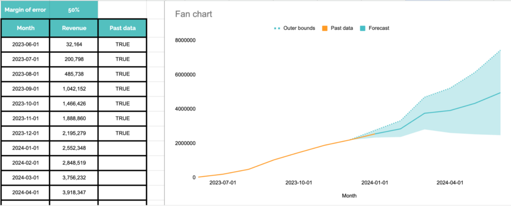
I’m a big fan of fan charts
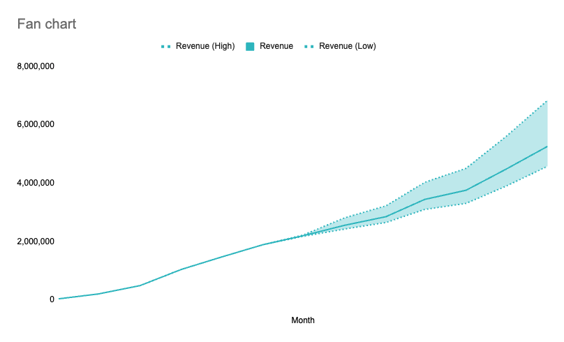
This is a fan chart which my colleague, Dave, made in Google Sheets. Don't worry about the specific data it’s showing, let’s just think about what it communicates.
When I read this chart, one of the things I think is “we’ve got a pretty clear idea of revenue until about half way through the year, and then it could fall in a range”.
Of course the other thing I think is “Wahey 📈📈📈”, but fan charts work just as well if it’s 📉📉📉.
You might recognise fan charts from tools like Causal Impact or Facebook Prophet, they are both great forecasting and statistical analysis tools we use at Aira.
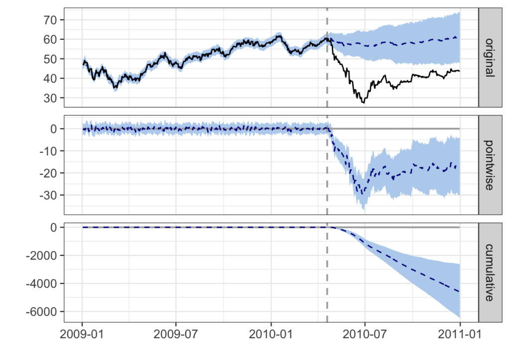
Example from Casual Impact
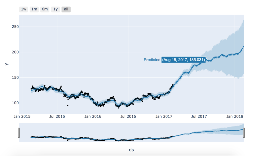
Example from Facebook Prophet
To use those predictive models the way we do at Aira, you usually need to be able to code (or you need access to a team like Aira’s Innovations team). But you don’t need code for the visualisation, which I think is a really overlooked part of their value.
Just having the quick, visual cue that the real answer probably falls somewhere within a range can speed up communication massively.
How do I make a fan chart in Google Sheets?
Luckily enough, Dave Westby and I put together a template sheet which you can use right here.
Just paste your data into this table. You don’t have to work in months, it can be in days, weeks, years, whatever. You can add as many rows as you want below the table and they will appear in the chart.
The ‘Revenue (Low)’ column is what you think the worst-case scenario is, ‘Revenue (high)’ is best case. You can rename the columns of course.
If you’re using the fan chart to show a combination of past data and a future prediction, you can use the ‘Past data’ column to mark a row as historical, and that’ll create the orange line in the chart.
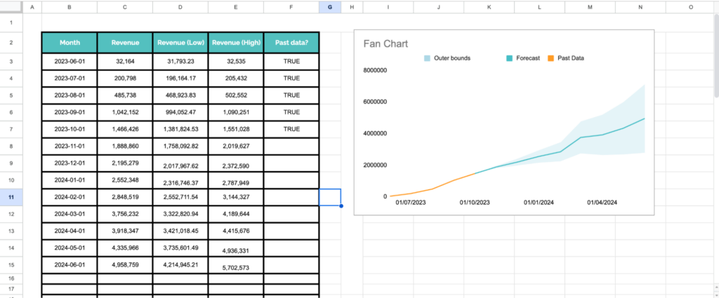
If you don’t know what your upper/lower bounds are but you think it could be plus or minus 20%, there’s also a tab where you can just put the number you want to chart, and then write your % margin of error and it will automatically calculate a fan chart for you.
Go forth and use fan charts!
As I mentioned before - there are some really powerful tools like Causal Impact and Facebook Prophet which produce fan charts as a kind of side effect of statistical analysis. The mathematical work that those libraries do is very valuable, but I think the fan chart visualisations are very much overlooked.
Thanks to tools like those, fan charts are an increasingly common way to express uncertainty so that business leaders can understand it and still make decisions.
Even if we only use them to reduce that friction, to get to the important conversations about how we’ll try to achieve the forecast, that’s a huge benefit.
So in summary:
- Forecasting is hard, and it’s basically impossible to get exact numbers
- We still need to base decisions on something, so our best options are to be as accurate as possible, and communicate our limitations
- Fan charts are a huge help in communicating limitations of a forecast
- Use our sample sheet to make your own!